3/20/10

Beachcombing & Shoptalk with Tim Clarke

tim
Santa Monica interior designer Tim Clarke is well known for creating sophisticated, unique spaces inspired by modern classicism.  His signature coastal-influenced aesthetic is highly sought-after by clients who want a new interpretation of a modern beach home.
coastal_modern-6
Coastal Modern is the very essence of the perfect beach house: Beautiful, inviting spaces that encourage warmth, community, and ease.
coastal_modern-5 coastal_modern-4
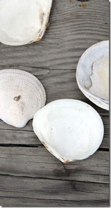
Though Tim borrows from the clean lines and well thought out simplicity of modern design, it is softened by organic shapes and textures.
coastal_modern-2 coastal_modern-8
He includes vintage pieces, locally sourced materials, and objects and mixes them into a soothing, muted color palette inspired by the colors of the beach and the sea.
dining coastal modern living room
coastal_modern-10
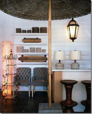
Named for the lifeguard station located just down the block, Tower 20 is Tim Clarke's popular retail store in Santa Monica, California. His eponymous retail location was opened in response to a demand by other interior designers and clients who wanted to purchase the unusual and eclectic furnishings and objects for which he is so well known. 
tower_20_10
Tim has a very simple goal: to infuse inspiration drawn from the coastal lifestyle and the essence of the "perfect beach house" into any space, regardless of size or location.
tower_20_6
From recycled teak tables and hand-blown glass hurricanes by impossible-to-find Belgian designers hand-made wooden furniture created by Italian skateboarders in Wyoming. 
tower_20_5
Gathering together a highly edited selection of art, objects, books, sophisticated textiles, and custom furnishings made to order, Tim Clarke Interiors and his Tower 20 offer products and inspiration unavailable anywhere else.
tower_20_8
"The contrast of this smooth, wide-plank table pared with tactile wicker chairs exemplifies the sensory experience of furnishings often found in a beach house, but this look works everywhere!"
tower_20_9
"The juxtaposition of sleek organic, Asian zen with classic French,...creates a calm but stimulating mood. The beach always comes out in my work, whether or not the project is on the water, because let's face it: Relaxed chic works anywhere." Tim Clarke
tower_20_7
Speaking of the beach, just across the street from the big blue Pacific ocean is another one of Tim's business ventures, the Blue Plate Oysterette.
bpo logo
He and owner Jenny Morton have created a restaurant with good old fashioned seaside charm!
bpo front
A striped awning defines the sidewalk terrace outside with 3 covet-able, at least on a balmy night, wooden picnic tables.
BP interior
And inside everyone is having a great time as a couple, friends, mothers and sons, fathers and daughters commandeer a table or space at the bar.
pbheader
Stop by Balustrade & Bitters Online Magazine to read more & take a video tour with Tim as your host!
oysterette_header
Tim Clarke Interiors, Tower 20 and now Blue Plate Oysterette all share Tim's common goal: to infuse inspiration drawn from the coastal lifestyle and bring the essence of California beach life into any space, regardless of size or location.
tower_20_1

Photos & graphics courtesy, Tim Clarke Interior Design, Tower 20, Blue Plate Oysterette, Balustrade & Bitters
visit Tim Clarke Interior Design Inc.
bpo_logo
click to visit Tower 20
visit Balustrade & Bitters Online Magazine

3/18/10

Inviting style indoors & out.

We are all beginning to feel & see a hint of spring from our windows.
Lonny
For some of us, dining outdoors is what we long for. Ask my bunch and they will all agree, if the sun is out, that's a good enough reason to fire up the Weber, walk the dog (again), head to the deck to study or to just relax with friends.

Lisa Warninger

 But because anything beyond a light breeze sends me back inside, I'm always looking for ways to bring nature indoors, especially to the table.

Lonny, I think.
I love a cloche filled with moss or just about anything green & growing! Last spring I showed you some clever examples of what you can put under these pretty glass pieces in "What's Under Your Cloche?" Here are some other beautiful ways to bring mother nature to the table.

Simple decorative touches like this gorgeous bronzed pomegranate vase/candle holder or this unusual bronzed branch flower vase, both from Bo-tan-ik, are perfect examples!

I adore this bronzed pomegranate salt & pepper set!

For a lighter touch, this etched botanical glassware serves a dual purpose holding simple glass votives.  I think that after dark, the etchings would be just beautiful!

And what could be more natural than these glass vases also from Bo-tan-ik, wrapped with natural Cyprus?

A birdsong from two sparrow paperweights, perfect for keeping paper goods in place when those breezy reminders of winter pay you one last visit! From my good friend Christina at My Sparrow.

The most impressive way to erase the boundaries between indoor and outdoor living is with the gracious, beautiful and practical designs of Richard Frinier.

Barcelona for Dedon by Richard Frinier

His sophisticated style adds instant al fresco glamour to any setting!

Andalusia for Century by Richard Frinier

His talents are matched only by his wonderful, insightful and humble personality.

Denpasar for Century by Richard Frinier

I discovered Richard Frinier last summer "On The Patio"

Just recently, Richard received the Lifetime Achievement Award from the International Casual Furnishings Association for his contributions to the casual industry as well as to his community.

  His lovely wife and business partner, Catherine, a luxury marketing publicist and event planner, stylized a memorable evening with a bash at the Mondrian, West Hollywood.  Family, friends, colleagues, clients, architects, designers, and curatorial friends, all came out to celebrate Richard’s 30-year career!
Here's to wishing you both, relaxing times together & continued success!
Lisa

3/2/10

What Can Brown Do For You?

Well, lot's of things!
Its richness does as much for my palate as it does for my interior palette.
tom-eckerle-white-dark-and-milk-chocolate-pieces Brown Velvet Paisley  
While chocolate crème brulee makes me very happy!
chocolate-creme-brulee-h via Sunset Magazine The stark contrast of handsome carved wood against fresh white millwork makes my heart pitter-patter!
Eric Roth wood touches
Brown serves as a good strong base and is perfectly happy to be a backdrop.
pink flowers against brown wall
But occasionally it cannot help itself and wants to join in the mix. These chocolate cosmos and black pepper berries bring a rich baroque feeling when mixed with pink & green hydrangeas.
brow cosmos by Brie Williams
It has been noted that people who prefer brown are often conventional and orderly. That's me!
However, my craving for chocolate brown has always gone well beyond the dessert course. I completely agree with what designer John Saladino has to say!
John Saladino for Veranda
Where beige seems boring, cocoa adds drama.
farm table by Tim Young
Where ebony seems severe, mocha appears flattering.
brown and whitle by James Merrell
This deliciously rich hue is the perfect complement to candy-colored pastels.
Wainscott by Farrow & Ball mocha brown by benjamin moore cocoa by Divine Color
So many shades and tones - each producing a different effect.
 eames by David Prince In fact, because the color looks so great on nearly everyone,
harp1 by Paul Westlake we call chocolate brown the new neutral.
When my summer glow is all gone, I always turn to my saving grace, Bobbi Brown. One brush of her magic can give me a fresh face & fresh outlook on the day, even when it's the dead of winter!
bobbi  bobbi-brown-300x279
Brown is the smell of nature. Its woodiness brings this gardener to her knees, literally, for hours.
 pine cone planting soil via Hartley Botanic
Solid and reliable, it's the color of earth and is abundant in nature.
adrian briscoe Light brown implies genuineness while dark brown is similar to wood or leather. This Hermes Brasilia saddle is talking to me!
Hermes Brasilia Saddle
Brown can also be sad and wistful.
Tim Young Men are more apt to say brown is one of their favorite colors. 
leather by David prince  While the color may be received by many as utilitarian, boring or conservative,
dresser by Ellen Silverman
for seventh and eighth-grade boys, brown bags are the cool way to go. And UPS has taken ownership of the color and used it as a point of distinction.
 intro-lunchbags brown-ups
Brown can mix into many surroundings.
rustic bath via Lonny
The negative meaning of brown can be a repressed personality or a lazy person,
Listening Chair by David prince  but still, it always gives a feeling of solidity. Someday I would love to live in a beautiful Beacon Hill Brownstone!
beacon-hill-boston-ma062 Brown can be stabilizing. I love this rosewood Eames Potato Chip Chair!
rosewood Eames potato chip chair Some shades of brown create a warm, comfortable feeling of wholesomeness, naturalness, and dependability.
virginia macdonald        And some shades of yummy brown just remind me of being a kid.
bowl I can think of a number of places where I have always enjoyed brown in my world. So tell me, what can brown do for you?
numbers  by David Prince
Just for the record, my favorite color is blue. I wonder if there is such a thing as navy brown
All photo credits linked to the source.